9-D Kite Reflection. Feburary 23,2012
1. The strong parts of my kite are the colors because they stand out and are easy to see.
2. I think I could have made my kite bigger because it will be hard to see in the sky.
3. My kite is a butterfly with moon and stars on the back. I chose this design because I wanted to make something to stand out.
4. The balance of my kite is bilateral because it will be easy to see the butterfly.
5. I chose cool colors for my kite because I wanted it to reflect the theme of my kite.
6. I learned that cool and warm colors can blend in with each other. This could be applied to visual careers by making things that flow or to put an unusual object in a enviornment.
My kite
The title of my kite is Moon Moth. The colors are blue, green, gold, and white. The balance is bilateral. I this because I wanted to change the style of art a bit of what I do.
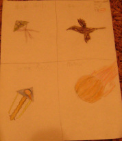
This is the preliminary design.
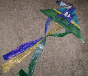
This is my overall finished kite.
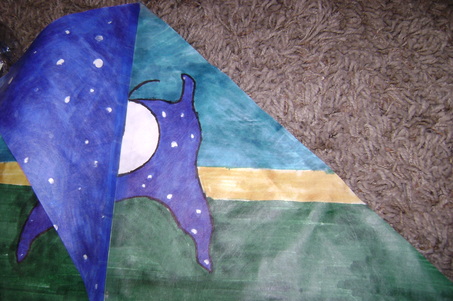
This is the right side of the kite.
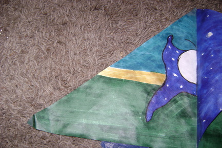
This is the left side of the kite.
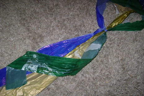
This is the tail of the kite.
